If you have landed on the Meridian Press homepage, you might have noticed it doesn't look like your typical tech agency website. There are no abstract blue gradients or stock photos of people shaking hands in glass meeting rooms. Instead, there is a bold, industrial red background and a grainy, grey machine.
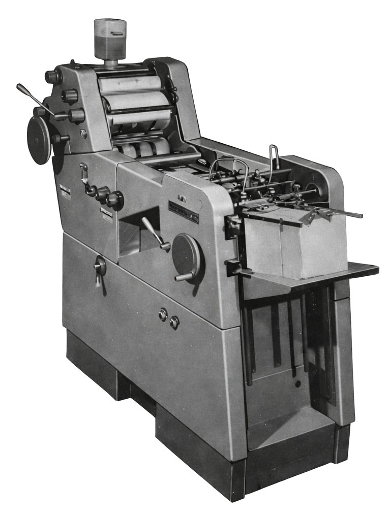
That machine is a Gestetner 211. For me, it isn’t just an aesthetic choice. It is where my professional life began.
The eBay Find
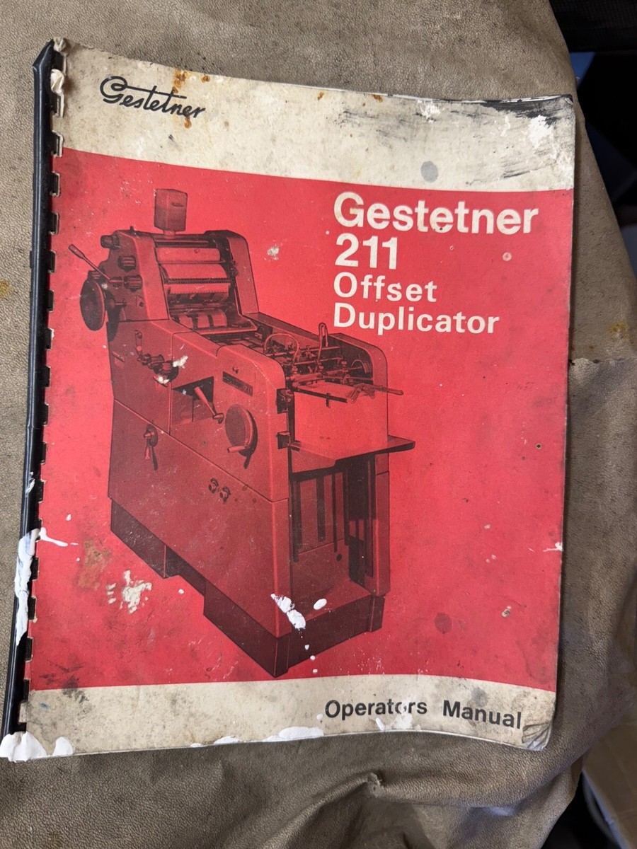
The design of this website was born from a moment of serendipity on eBay. I stumbled across a listing for an original Operator's Manual for the Gestetner 211 "Offset Duplicator."
Seeing that cover image with the stark, heavy machinery floating in a sea of red ink stopped me in my tracks. I didn't just see a vintage booklet. I saw a piece of my own history. I realized immediately that this manual shouldn't just sit in a drawer. It should be the style guide for Meridian Press.
1987: The Cornerstone of the Family Business
To explain why this machine matters, we have to rewind to 1987. I had just finished my O Levels and joined our family printing business.
At the time, the Gestetner 211 was the absolute cornerstone of our operation. I literally watched millions of pages roll off these presses over the years. We printed everything from complex forms for major UK corporations to business stationery for local tradesmen. If you held a piece of paper in the 1970s or 80s, there was a chance it came off a 211.
The marketing of the machine was fascinatingly misleading. Gestetner sold it as a "duplicator" and pitched it to schools, churches, and parish councils as if it were a slightly upgraded spirit duplicator. In reality, they were selling unsuspecting vicars and headmasters a fully-fledged small offset litho press.
This wasn't a "press a button and walk away" machine. It required a skilled operator to balance the ink and water, to register the paper, and to manage the speed. It was a machine that demanded respect.
A Design That Works
When I looked at that manual on eBay, I was taken by how confident the design was. It possesses a strange, functional beauty that is hard to find today.
There is a wonderful tension in the artwork. You have the "no-nonsense" sans-serif font of the title which feels clear, instructional, and solid. This counters the almost handwritten, flowy style of the classic Gestetner logo. Then there is the duotone effect. The cold, greyscale mechanical precision of the press is set against that warm, aggressive red background.
I found it strangely pleasing. It felt honest.
Why It Matters for Web Design
I decided to adopt this manual as the blueprint for the Meridian Press website. But why use 40-year-old print technology to sell modern web design?
Because the philosophy holds up. Just like that manual was designed to guide an operator through a complex machine, our goal is to guide clients through the complex machinery of the web. As our homepage says: "Web design, with hand-holding included."
Furthermore, I believe that using a piece of design that is both personal and relevant brings something special to the work. In an era of templates and AI-generated layouts, leaning into your own history adds a layer of soul and authenticity that you can't fake.
The Gestetner 211 was a workhorse that helped build businesses in the 1980s. I like to think we’re doing the exact same thing today. Just with fewer ink stains on our fingers.